
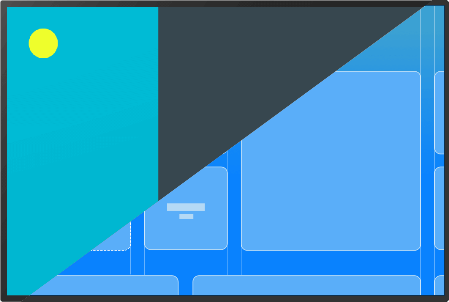
2020
TVOS
Connected TV
01
Digitally connect our guests to the room, to the hotel and to the people, personalizing every touchpoint, guided by world-class hospitality & optimized operations.
My Role
Wireframing, UI, Prototyping, Animation
My Process
Discover
Ideation
Prototype
Validation
2019
Android | IOS
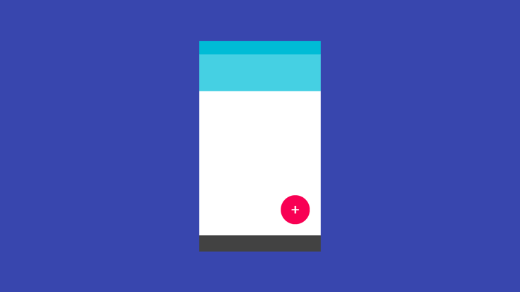
Connected App
02
Digitally connect our guests to the room, to the hotel and to the people, personalizing every touchpoint, guided by world-class hospitality & optimized operations.
My Role
Wireframing, UI, Prototyping, Animation
My Process
Discover
Ideation
Prototype
Validation
2018
Android | IOS | IPAD
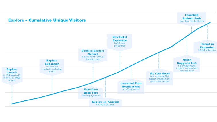
Explore
03
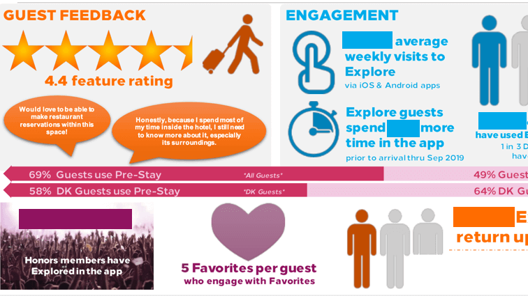
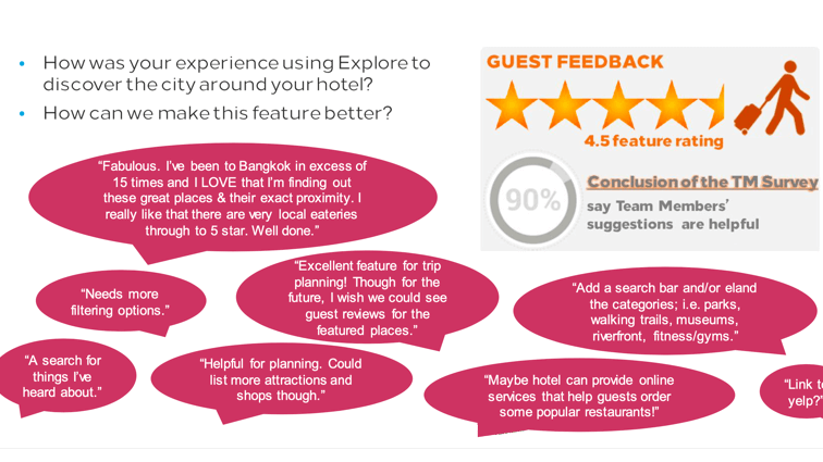
Allow hotel guests to discover places close to their hotel from which to visit or order. Team members who work in that city would recommend certain spots called "Team Member Recommendations."
My Role
Research, Wireframing, UI, Prototyping, Animation
My Process
Discover
Ideation
Prototype
Validation
2017
Android
Digital Key
04
Digital Key is a feature in-the Hilton Honors app that allows a user to unlock their hotel room with their smartphone inside the Hilton Honors App.
My Role
Wireframing, UI, Prototyping, Animation
My Process
Discover
Ideation
Prototype
Validation
2019
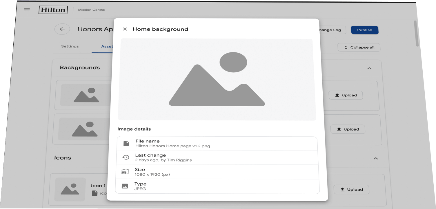
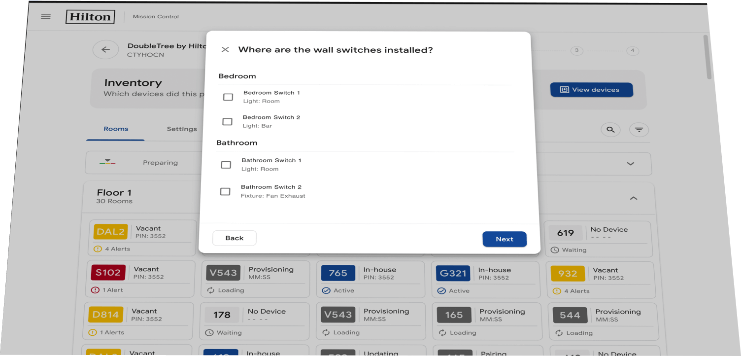
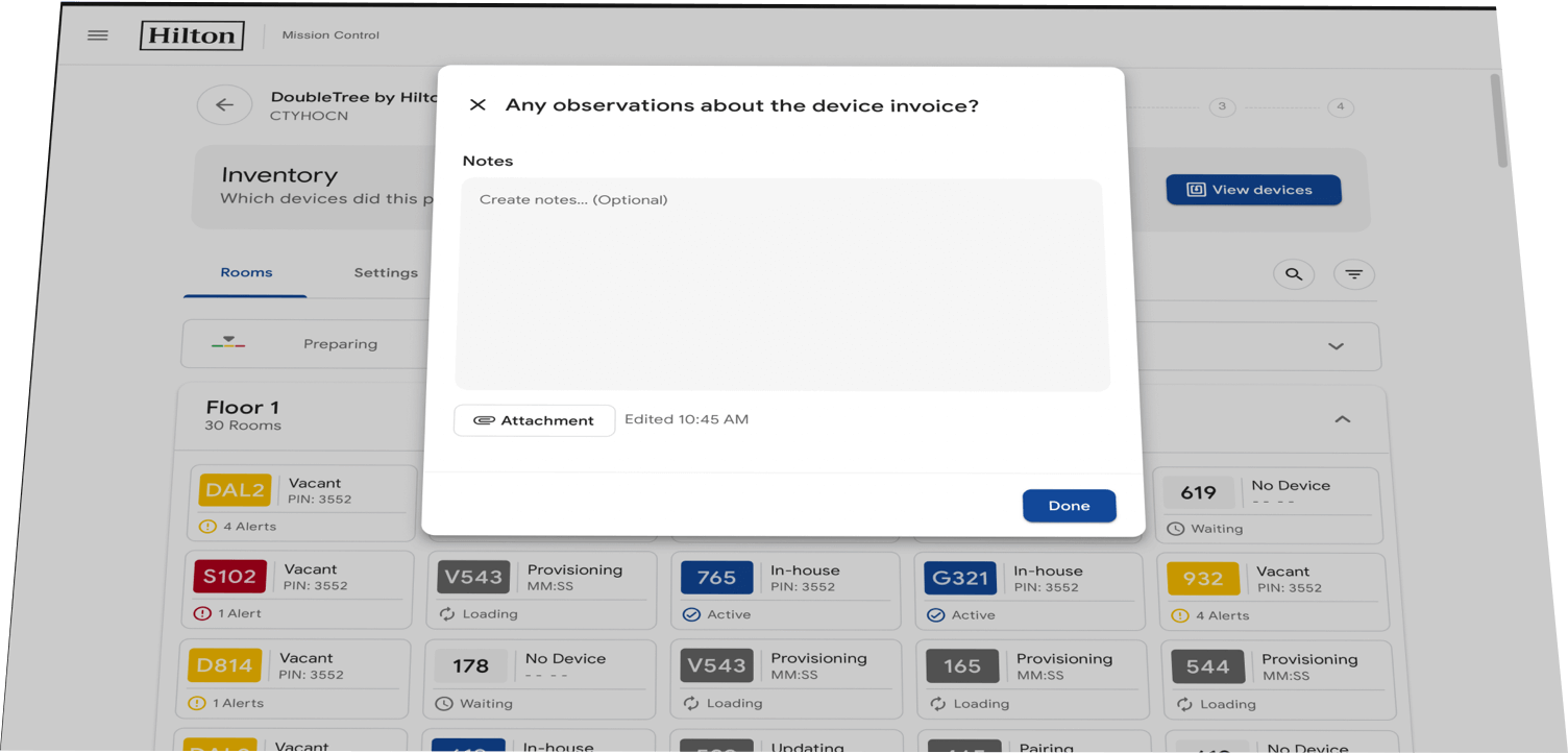
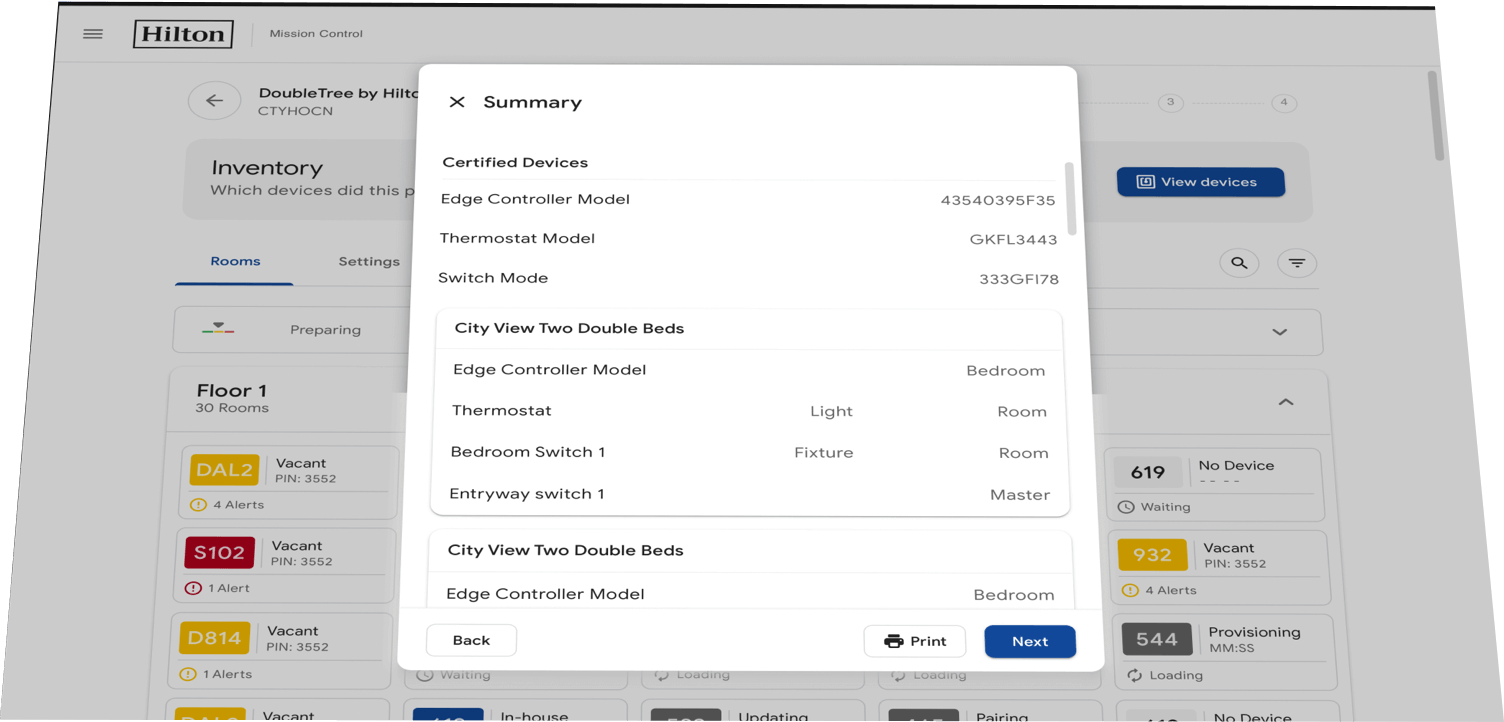
Smart Screen | Web | Tablet
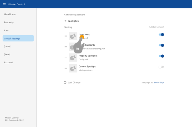
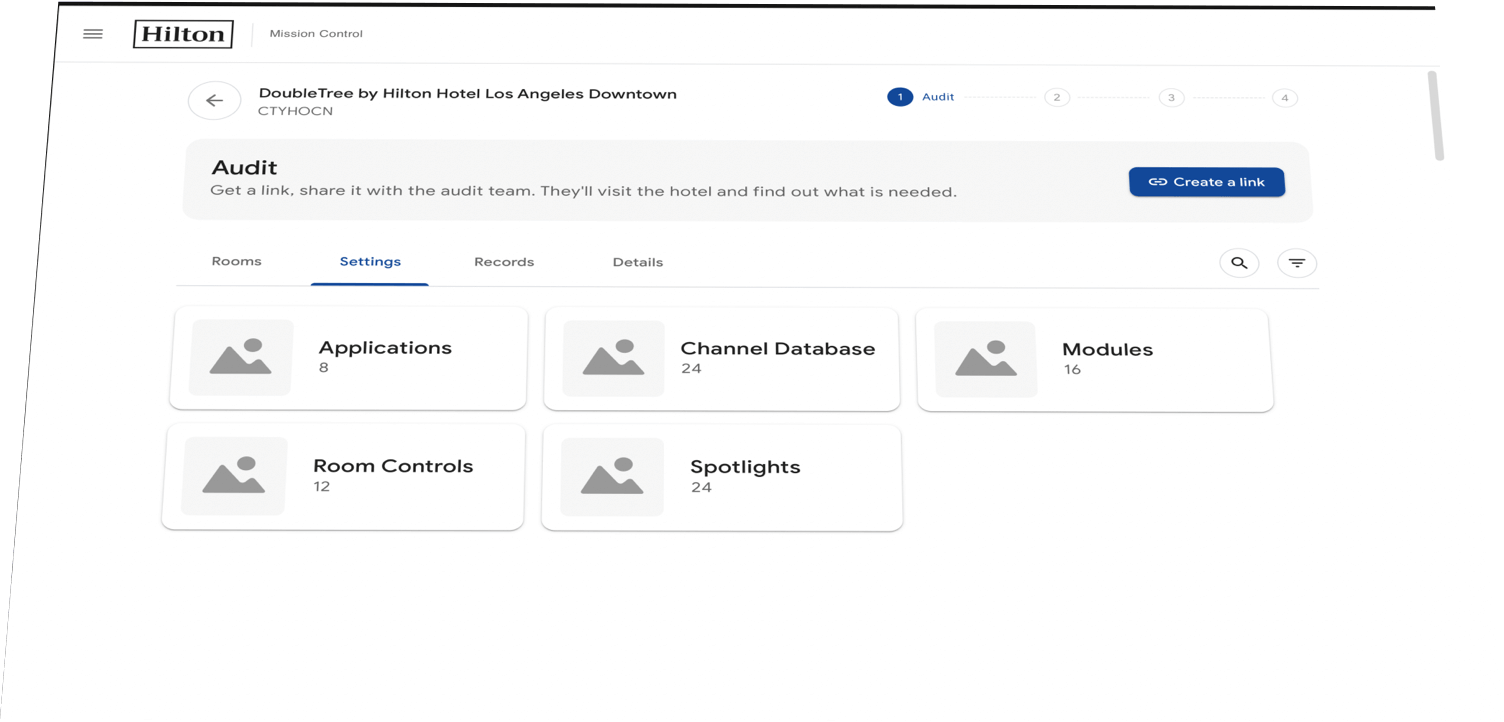
Mission Control
05
Onboarding & controling IoT device deployment inside of Smart Hotel rooms. This dashboard would be used by technicians installing devices and seen on a variety of screen sizes.
My Role
Wireframing, UI
My Process
Discover
Ideation
UI
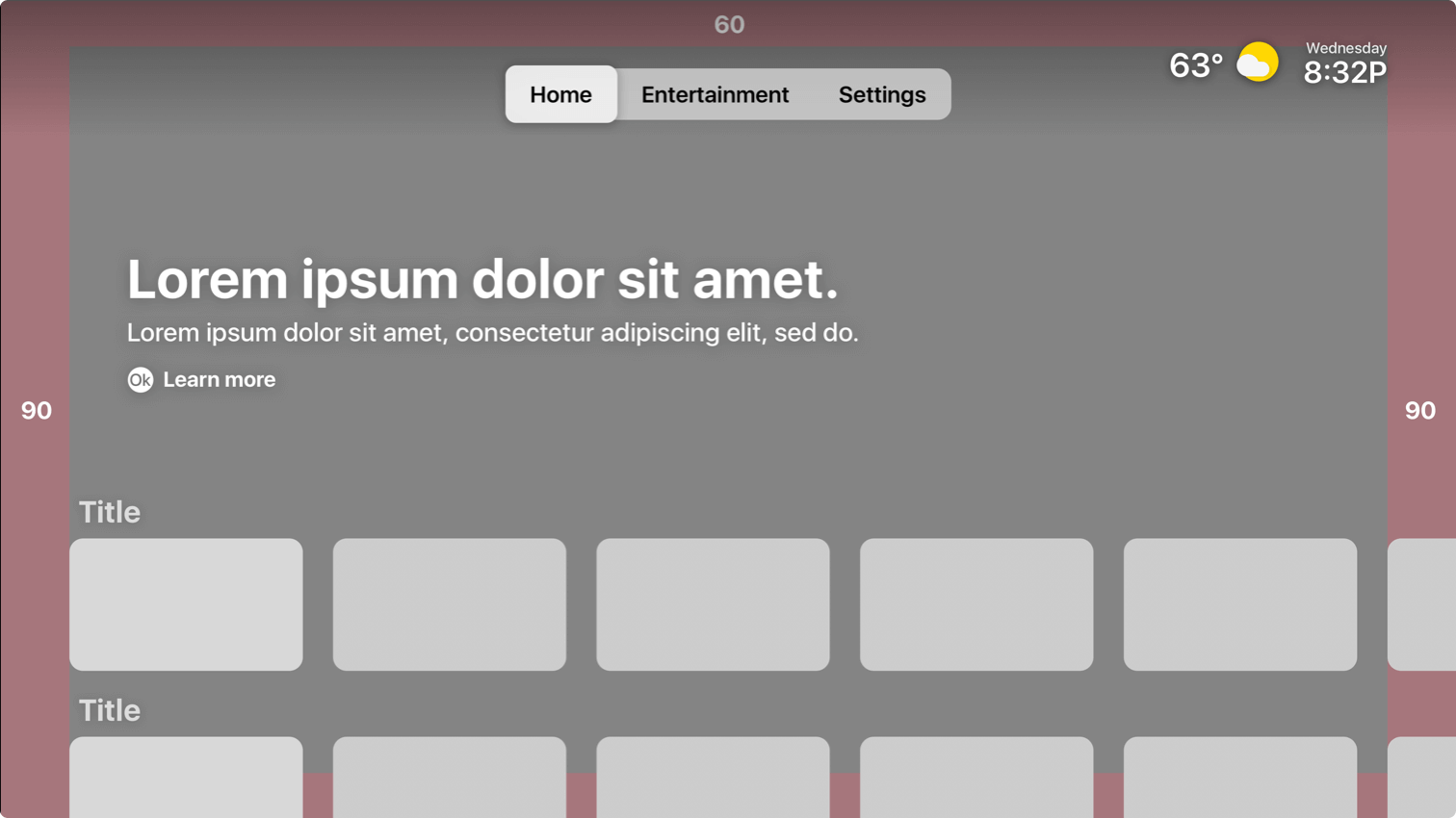
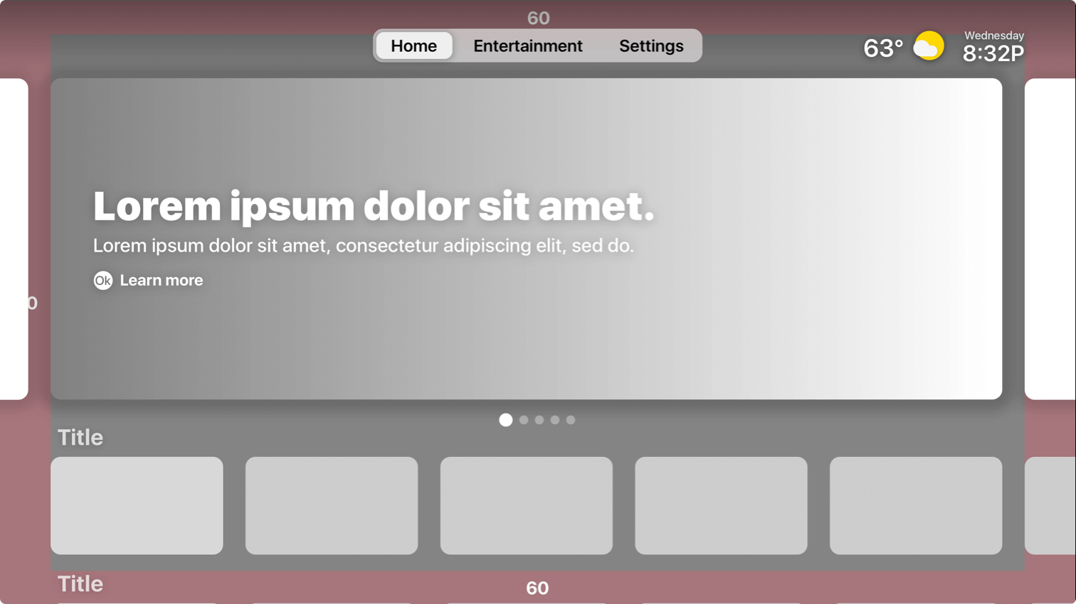
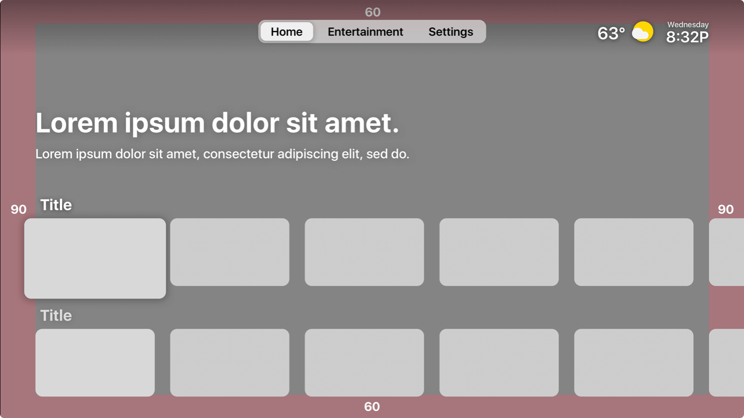
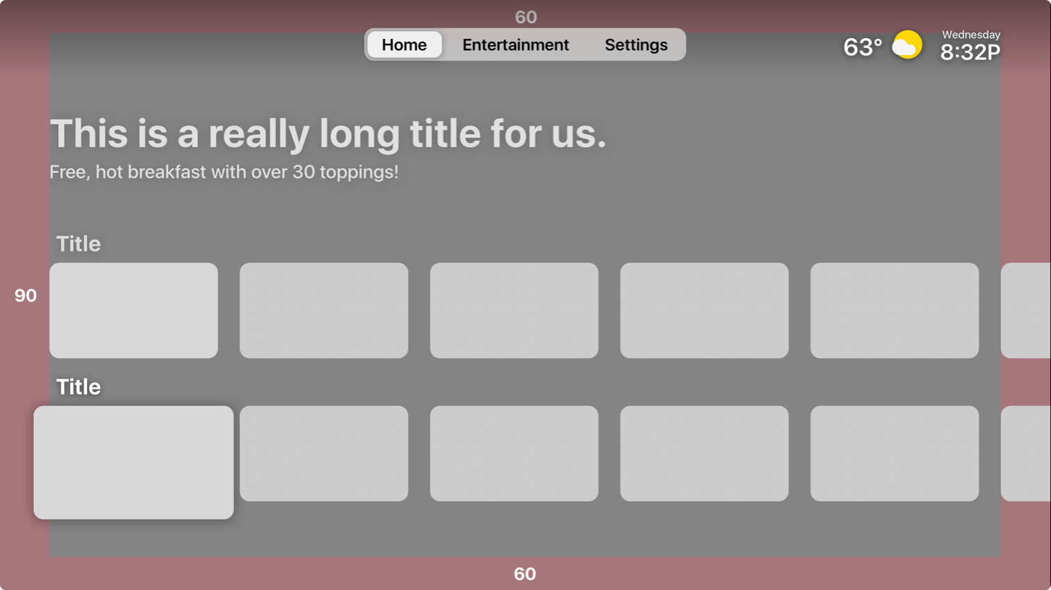
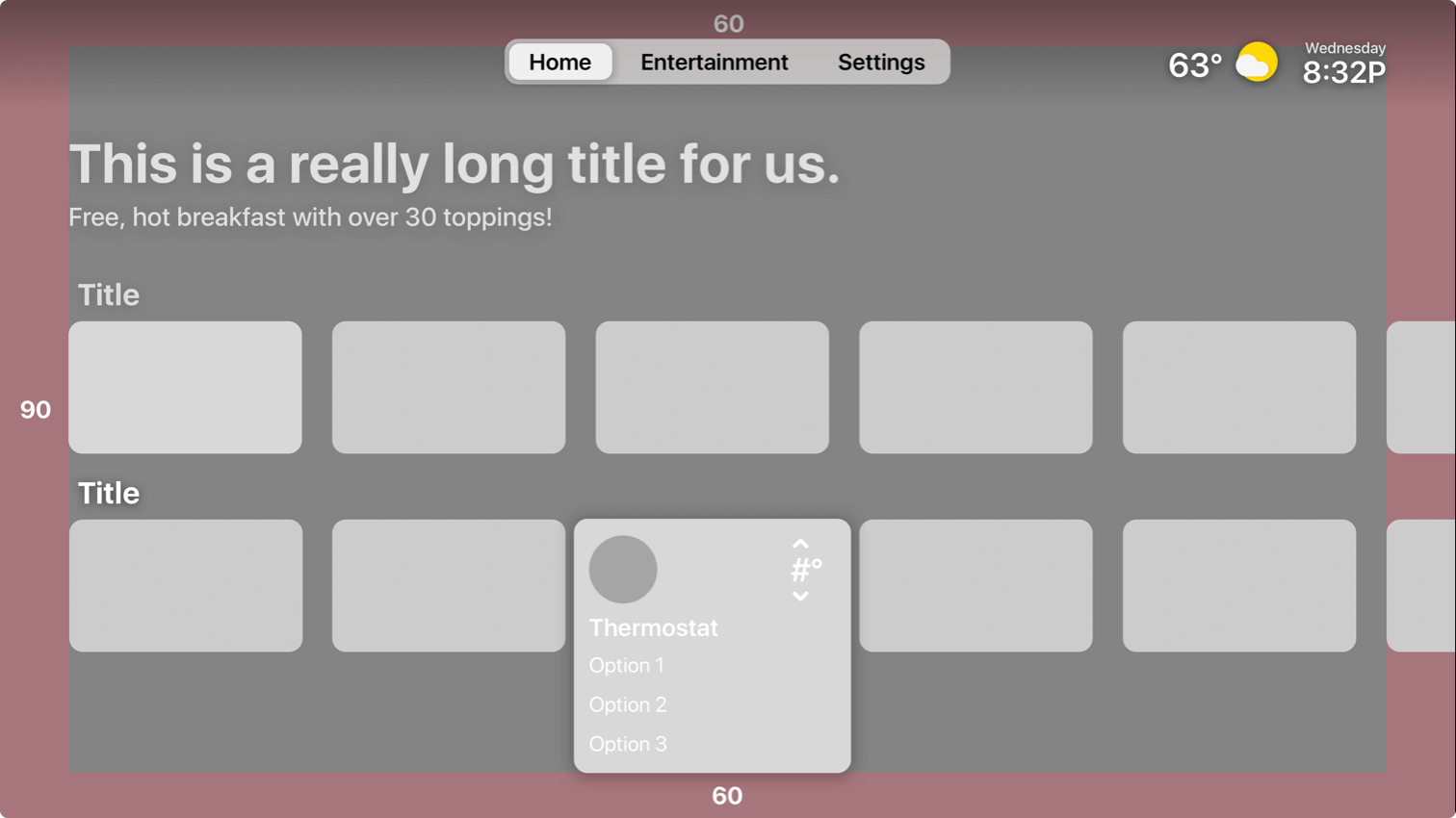
The challenge
Create an immersive experience with the TV with high-quality content and easily accessible smart room controls, while creating cost saving features to increase adoption rates with Hotel owners.
High level goals
• Increase in navigation awareness
• Better Focus states
• Easier room control interactions
• Spotlights CTA’s are more noticeable
Discover
I first wanted to get an in-depth grasp of TV UI, and the differences associated with designing on a large screen. I delved into Android TV standards and TVOS to become award of important aspects and constraints associated with TV. Then I was able to do a competitive analysis of other TV UI to see how they problem solved some of our key issues we were having.
Ideation
I worked on trying to solve some of the readability issues users were having while maintaining the cinematic look that TV should offer. It was a hard balance between using typical design tools like gradients and keeping a clean balanced approached on such a image heavy UI elements. I made sure to build on an extreme use case for future asset compatibility.
Prototype
I used ProtoPie to prototype the TV UI to address issues like the highlight state, as well as determining the appropriate movement of elements as you navigate through elements. It was vital that we tested sound UI and the micro-interactions with the prototype to see if it helped users navigate through elements. You can read my medium article on how I built the prototype here.
Validate
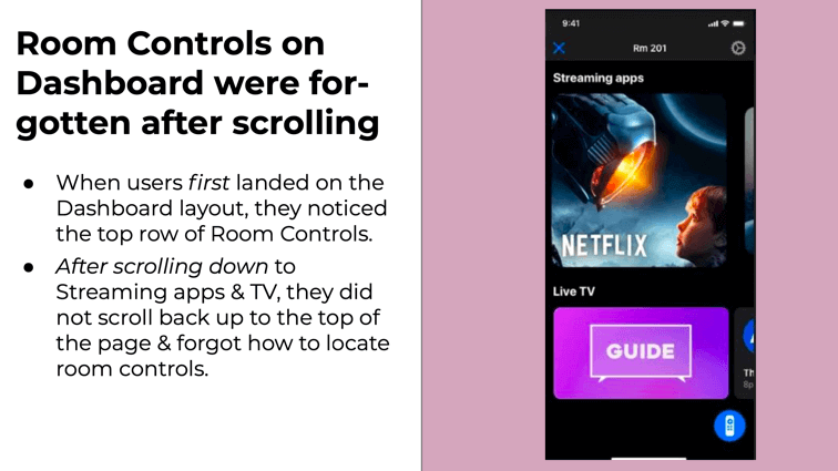
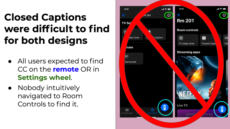
My team conducted in-person usability sessions to see how users completed certain tasks when given some context. I was curious to see if the highlight state was more noticeable, as well as the Thermostat selection was more intuitive.
- Top navigation menu style
- Spotlight CTA’s
- Room Control interactions
- Highlight states
The challenge
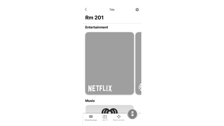
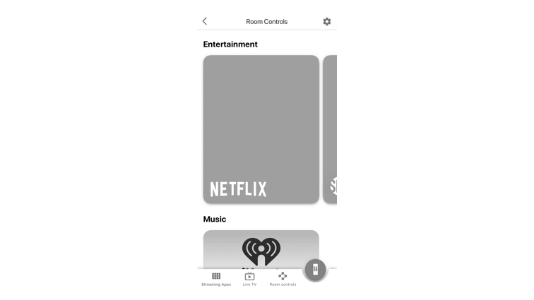
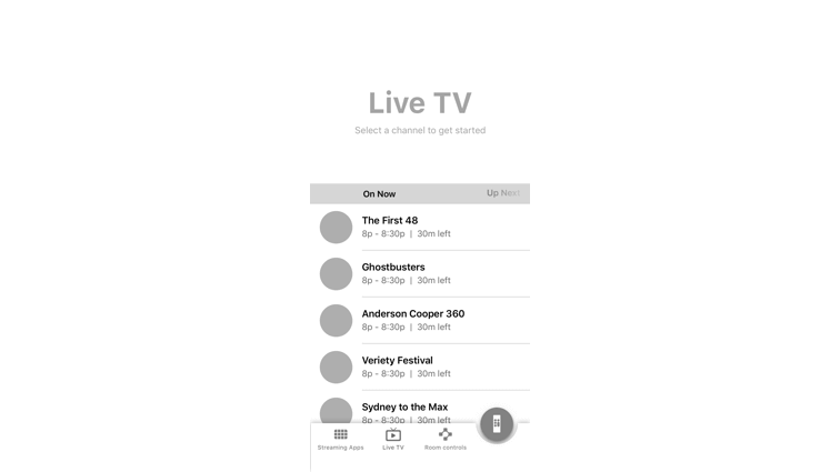
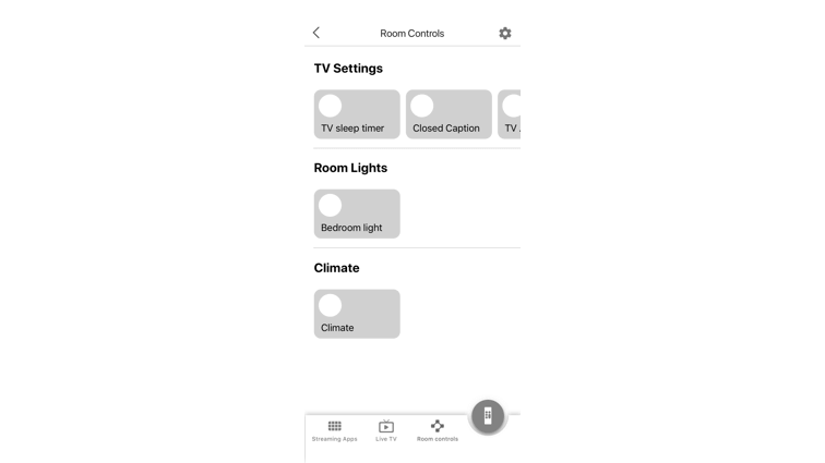
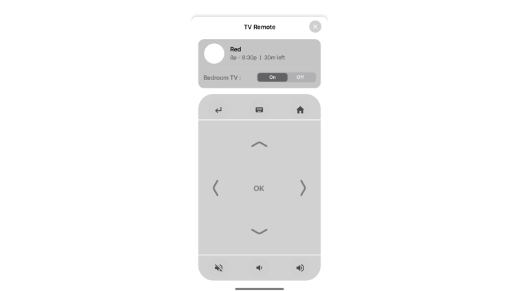
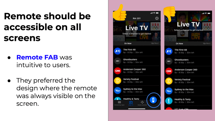
Creating a dark theme app that helped users easily navigate entertainment options by providing quick access to IoT devices and the TV remote.
High level goals
• Easy access to room controls
• Browsing through live tv
• High focus on streaming apps
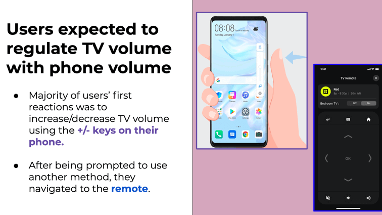
• Remote functionality with TV
Discover
I did a competitive analysis of many smart home apps to see how they were solving things to understand with what users were familiar. I also researched dark theme standards and best practices on Android and IOS to know how to design using a dark theme.
Prototype
I used Protopie & Principle to create a working prototype to test with real users. It was essential to test on an actual phone so that we can check the dark theme’s readability, as well as the remote interaction with the TV.
The challenge
Create a user-friendly experience that helped users discover exciting experiences near their hotel while using the Hilton Honors App.
High level goals
• Promoted Hilton Team Member recommendations
• Allow users to easily see what is around the hotel; pre-stay & in-stay
• Personalized interactive experience
Discover
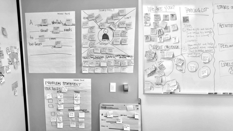
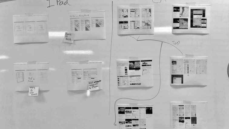
Our team worked through some workshops to truly understand our users and their needs. The personas we created allowed us to prioritize certain features that helped the user plan their stay while using Explore. After doing competitive research with Yelp & Google Maps, we were able to pinpoint trouble areas, and solution aspects we felt were important to our users.
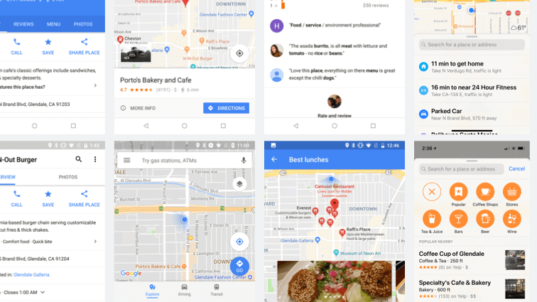
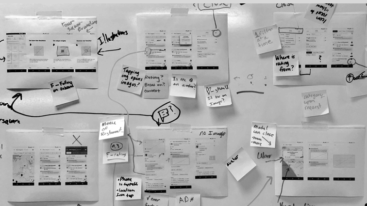
Prototype
The prototype was vital to understanding and measuring the interaction between the list view and the map view. We wanted to make sure that users could easily navigate both views while staying close to the hotel.
The challenge
Create a singular touchpoint that allowed users to quickly access their Digital Key anywhere in the Hilton App while accounting for a multitude of variants.
High level goals
• Increase in navigation awareness
• Better Focus states
• Easier room control interactions
• Spotlights CTA’s are more noticeable
Discover
I was designing for the android Hilton Honors app, which allowed me to use the android FAB (Floating Action Button).
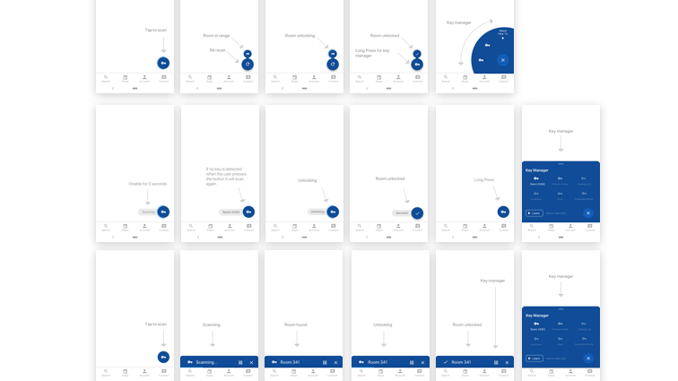
Ideation
The wireframe stage had many key issues I needed to solve. A user needed to start an initial scan for a door, unlock the door that was in range, and access a digital key manager. I was able to create three versions that addressed these areas in different ways.
Prototype
My team conducted online testing to determine which versions with which users found it easier to interact. Users felt that a text hint expanding during certain phases helped the user understand what stage they were at, and when it was ready to unlock.
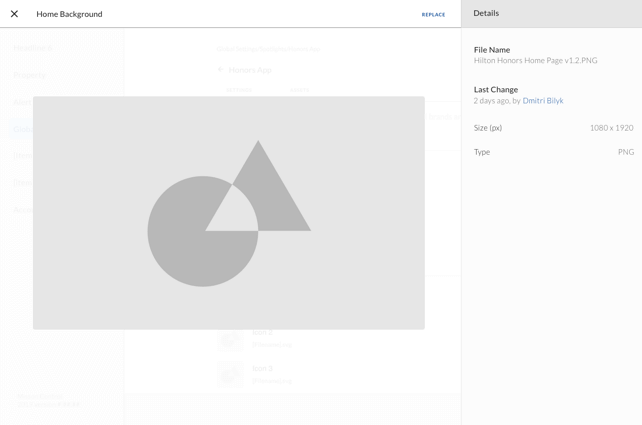
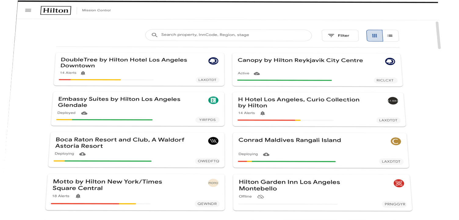
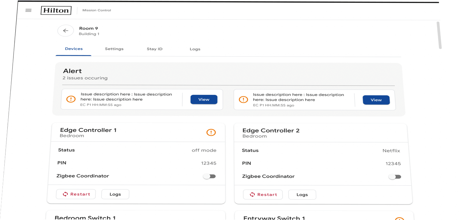
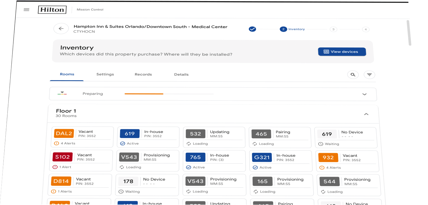
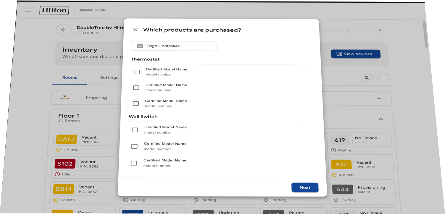
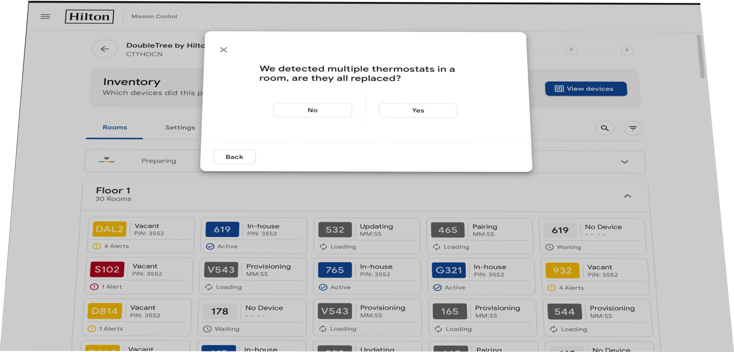
The challenge
With any dashboard UI, the vast amount of information you have to account for is challenging. Creating a framework that would be usable on a variety of screen sizes as well as touch devices would be a challenge.
High level goals
• Simplify hierarchy
• Create an invisible UI
• Responsive UI
Discover
I researched data table usage in both Bootstrap 4 as well as material design guidelines. I wanted to make sure I was designing clear and simple grids that were easily scannable for Hilton employees who would be using this system. I also needed to make sure all of my grids and patterns were easily scaled up and down depending on the screen a user was using.
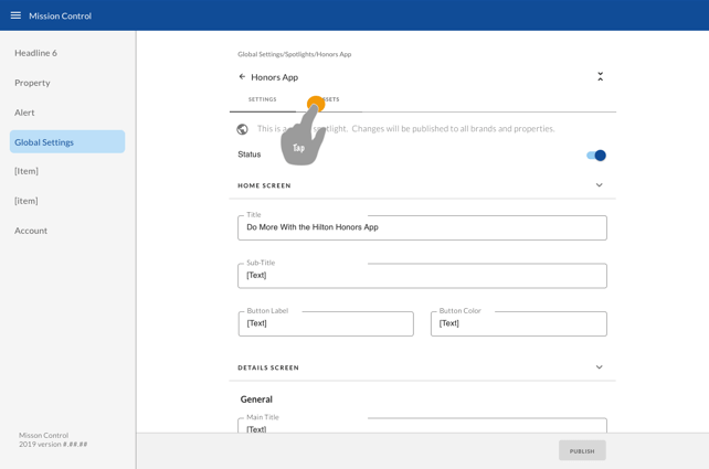
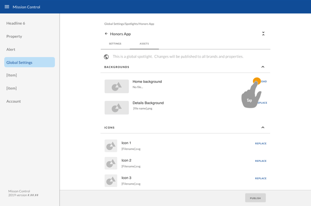
Ideation
Our UX researcher did a great job of creating initial wireframes for me to then re-work and adapt the material design system. The challenge I faced was organizing a mass of data and presenting it in a way that simplified the hierarchy and allowed users to scan the columns and rows of data to find what they were looking for.
Design
My priority was data grouping into cells and rows. I designed on a responsive grid and made sure to allow for adjustable margins and gutters. For the UI itself, I afforded a lot of space to most items so that I could limit the density of things like borders, drop shadow, and button sizes. I wanted to create an invisible UI while also creating an extremely efficient, simple interface. Due to the large amount of data and irregularity of it, my design system followed the atomic design thinking.
© 2020 KWORK LLC. All right reserved.